2023’s Top Sports Scroll Stoppers
Standing Out from the Noise: 10 of The Most Engaging Sports Design Posts during the 2023 season
Social media has evolved to enable endless, effortless scrolling - a constant stream of content showing up in our feeds to keep us glued to our screens. While these platforms have helped with building connections and community building, the ease of scrolling has diminished our appreciation for individual, quality posts.
Yet there still exist “scroll stoppers” - those posts that are too thought-provoking or impactful to scroll past. Scroll stoppers shine through the noise, giving us pause and reminder that powerful content will always prevail and catch a viewer’s attention regardless of scrolling habits or tendencies.
When I first introduced the concept of “Scroll Stoppers of the Week” earlier this fall, it was to serve the following:
Build a community-first moodboard (using Pinterest)
Highlight creatives and teams that push the boundaries to catch a viewer’s attention
Inspire others to explore and have fun!
For this post, specifically, I wanted to highlight the top 10 performing “scroll stoppers” (or creatives with multiple posts) that accumulated the most engagement from the Pinterest board.
A couple points of consideration before we get started:
This is purely for fun – please take the order of this list with a grain of salt. The goal is to highlight content that was influential and inspirational to creatives this year
The curation of this list strictly references statistical performance from Pinterest’s platform and algorithm (using impressions, clicks, and saves)
Pins that were added to the board earlier likely had a higher tendency of influencing creator’s feeds and viewership
USC Football
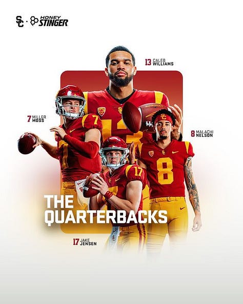
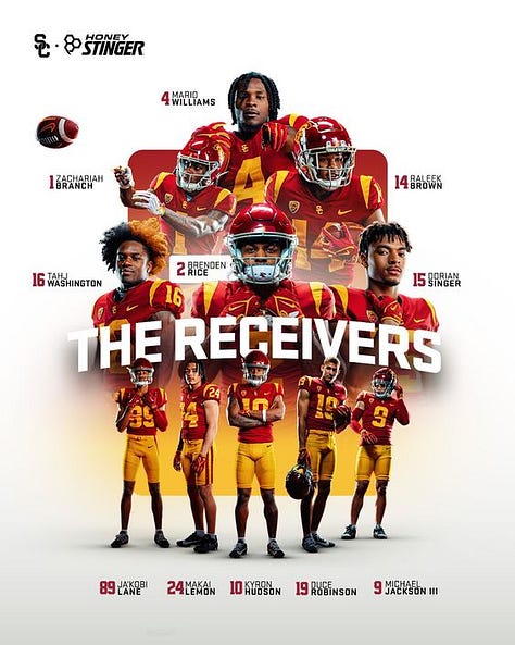
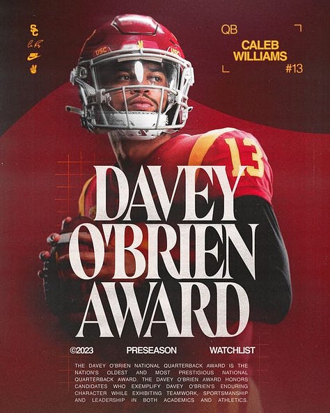
I think most would agree when I say USC Football’s creative direction over the last few months was some of the best we have seen this season. In fact, the numbers back this claim up, with the 3 posts above garnering the top most interaction (with over 70k impressions) among all pins on the board. What Luke Cuellar and Harrison Cho did with these preseason graphics set the tone for what was to come all season.
Here’s what I said during the season:
Reason why I like this series from @uscfb:
Most teams capture media day content for every player on the team, and generally, only 25-30% of those selects see the light on social.
Graphics like these drive visibility and preseason familiarity.
Well done to the whole team here! A huge inspiration for many creatives heading into the future.
Note: I bundled the 3 posts above to count as one so we can see more names on this list 😉
Temple Football
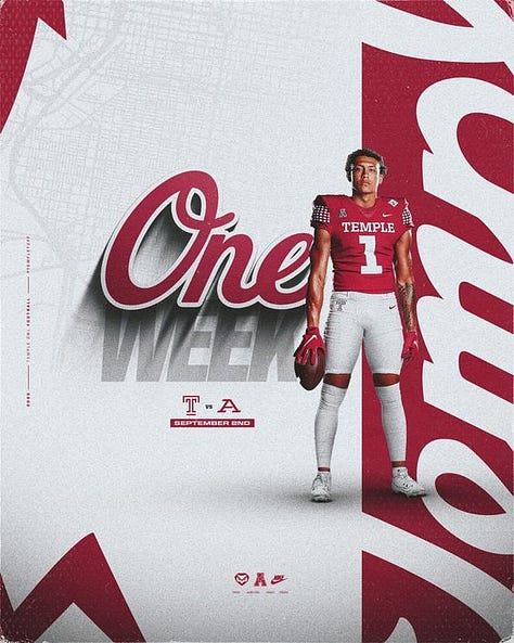
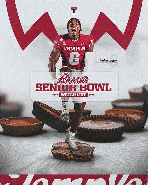
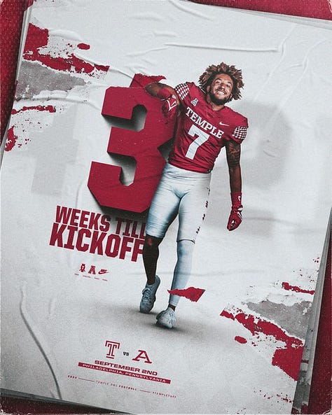
For many folks, seeing what Anthony Getz’s name up here won’t come as a surprise. The creative package for Temple Football has been one that has remained extremely consistent, which is a testament to the attention given here. If you ask me, I’m also not surprised to see these graphics generating this amount of interaction (over 40k impressions). Getzy uses two popular design styles here that took over the CFB sphere this year: the Long Path Shadow effect, and Lens Blur Effect. But it wasn’t just about following trending styles, these graphics were pillars of inspiration for others who also wanted to try these out!
Great job to the Temple FB creative team here.
Boston College Football
When we talk about scroll stopping content, it’s hard to think of a scenario where Anthony Garro doesn’t make the list. This graphic right here symbolizes everything this list is about: finding ways to creatively catch the attention of a viewer to spend an extra second analyzing a design. For me, it was the motion blur, dust particles, and perspective that kept me zooming in to see more.
FC Barcelona
Generating over 13.1k impressions, it’s no surprise to see this promo graphic from FC Barcelona top the Scroll Stoppers list. Lots to love with this match graphic:
Use of multiple player cutouts w/ defined perspective
Studio lighting to enhance player details
Brand primary colors that stand out
The graphic is very easy to decipher, and a big reason it has over 100 saves for others to follow a similar structure.
Kansas City Chiefs
All season long, Nick Gougas and the Chiefs social + creative team have nailed it with the consistency in their brand style. The designs feel minimal and familiar, making it very easy to find inspiration from. With this Travis Kelce milestone graphic specifically, it was very clear to follow along with the significance of the moment, while appreciating the abstract shapes and brand colors that make up the foundation for this.
Oregon State Football
It’s hard not to stop scrolling when you see one of Jake Namisnak’s post. There is always a sense of color harmony and consistency in layouts that make these graphics stand out. For this watch list graphic, everything about this composition was balanced out exteremely well, with the typography complimenting the studio image and details very well. Just incredible!
Syracuse Football
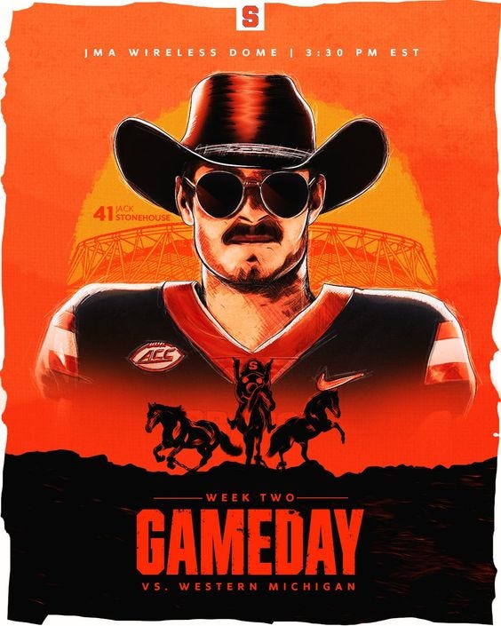
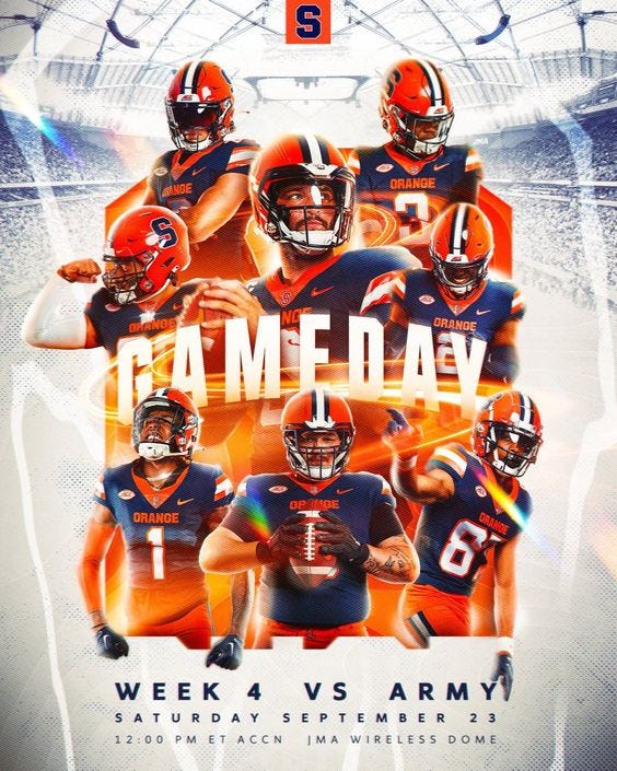
It’s always fun to see familiar faces make the scroll stoppers list 🍊! Ahmad Ragland, Quinn Carletta and the squad with Syracuse Football had multiple gameday graphics this season that generated buzz and inspired 500+ people to save these in their own inspirational boards. Here’s what stands out to me: two graphics with very different artistic styles, but those that maintain the core principles of the brand and informing an audience. Design should be about having fun and this is what I gathered from seeing these two graphics.
Green Bay Packers
This is a really good example of understanding how to playfully use a pop culture style in the context of a social graphic! Ben Borus created something that not only made people say, “Yeah, I need this on a shirt ASAP”, but found a way to generate buzz from the creative world, inspiring 200+ creatives to save for future t shirt designs.
Oregon Football
One of the earliest scroll stoppers on the list, Jaxx Mikula and the Oregon FB creative team gave us these really vibrant watch list graphics, blending abstract gradient tones of Oregon’s primary brand colors. For me, I really enjoyed seeing a fusion of a few different design styles complimented by a clean text header to highlight the award. With a brand like Oregon, its no surprise to me to see how Pinterest chose to share this with over 7k viewers.
Notre Dame Football
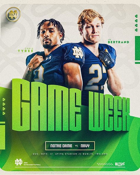
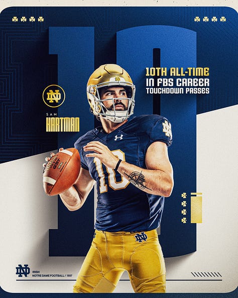
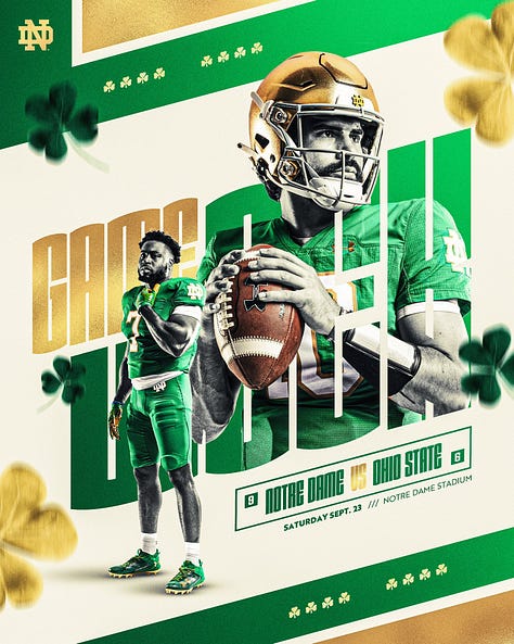
The best brands know what it takes to stand out! Take a look at these designs: 3 different variations of the same foundation and brand style, screaming Notre Dame Football before digging into the details. With these graphics, Bo Savage and Adam Spizzirri showed us how powerful experimentation and exploration is within a brand’s scope, especially when you can uniquely tie it to specific game experiences. A visual masterclass here!
These posts not only captured attention but also set new standards in sports content creation.
Which one inspired you the most? Let me know below!


