Breakdown: How I Helped Unveil the new Clippers City Uniforms!
Hey everyone!
It’s been three weeks since my last post! I’ve been bursting with ideas, and even though I want to keep this as a fun and consistent way to dump my thoughts, I want to make sure this doesn’t feel like a chore. So, if you’re trying to build habits just like me, you’re not alone.
Here's my challenge to myself and all of you: Create regularly, even when you’re not feeling it.
Carve out time weekly to improve on your weaker areas.
Keep at it until you're confident enough to show off your skills.
Now, let's take a detour.
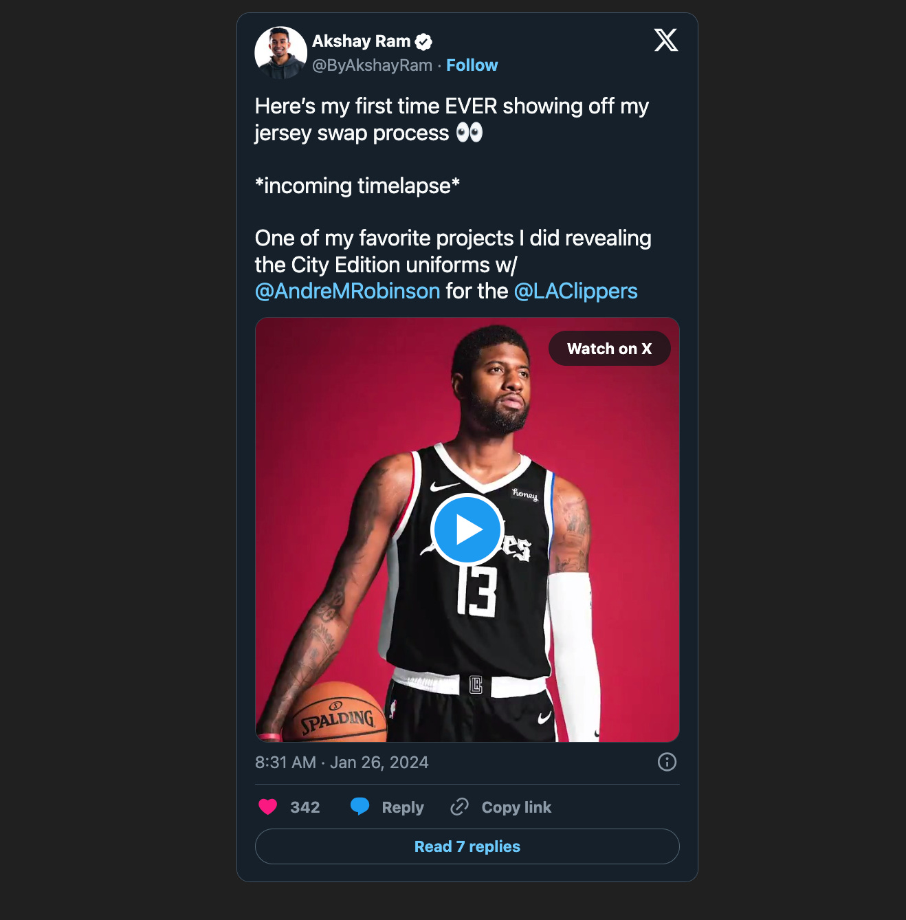
On Friday, I posted a timelapse of one of my favorite projects I did with the LA Clippers back in 2020. Once I posted, I got this question, and it felt like the perfect opportunity for me to break this project down more.
As we all know, It was a tough year, going through a pandemic. I was supposed to intern with the Clippers that summer in Business Operations but COVID had other plans. Still, I got to do some awesome freelance work with their creative team for the NBA Bubble and the 2021 season.
The Clippers were launching new jerseys but couldn’t do a photoshoot with the players. So, Andre Robinson and his team decided on a campaign that showcased LA’s story, and I helped by swapping jerseys on cutouts of Paul George and Kawhi Leonard. It was a neat challenge since the new jerseys were basically a color flip from the previous year’s.
Here’s a quick breakdown of how I did the jersey swaps:
Start with Creating a Clean Base: I used tools like the Healing Tool and Clone Stamp to strip the original elements from the Association jerseys, keeping the quality intact. Always build out a foundation for what you will be placing on top of the jersey. These are two tools that helped me create my gray base layer.
Change Colors Carefully: Using black and white layers, I removed color overcasts and then darkened the white jerseys with Curves adjustments, ensuring the original details and lighting stayed true.
Detailing is Key: When adding new elements like wordmarks or numbers, it's vital to match them with the new jersey’s color and the player's skin tone.
Get the Lighting Right: Adjust the lighting to match the player’s original photo, using techniques like Dodge and Burn and curves adjustments.
Color Correct Everything: Don’t just slap on color correction layers. Be meticulous with tools like Hue/Saturation and Selective Color to get the colors just right. To my young designers out there: dragging in that “CC” group of layers will not cut it. I highly encourage learning how to use the Hue/Saturation and Selective Color adjustment layers. Make selective edits to your image where you control all areas that a specific colors appears in.
The problem with just adding a bunch of “CC” layers is that they remove the total number of colors that can appear when exporting out the file. Think about it this way: instead of seeing a region of colors representing red with 200 shades, you may only see 10 at export. That’s because you are minimizing the output of color pixels but stacking unnecessary adjustment groups.
And there you have it, a quick tour of this project I loved working on. HUGE shoutout to Andre Robinson for taking advantage of the opportunity to double-up on the work for the promo video by asking for the timelapse! Great touch to the jersey reveal.
For those who want to see exactly how it all came together, layer by layer:
If you want more exclusive breakdowns like this, subscribe to the blog. IT’S FREE!
Moving forward, I want to add a section to these highlighting one piece of content from my Scroll Stoppers list to show some love to the creative!
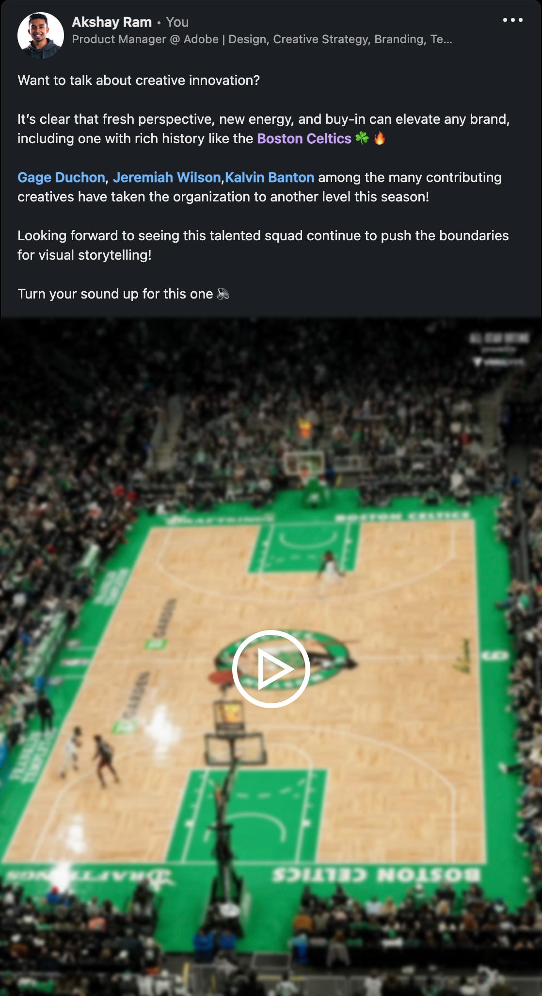
For this week, its Gage Duchon with this awesome video for the Boston Celtics!


